Search the Blog
Network With ReelCast


Films For The Family

Inspirational Web Videos

Film Festival

Blog Archives
Admin Login

Entries in Color Correction (14)

8:00AM

The Three Most Common Mistakes Of Amateur Colorists

Many filmmakers are now attempting to color grade their own work. Here’s why some are coming up short, both technically and creatively.

It wasn’t that long ago that color correction was an extremely costly process that was reserved for high-end productions working with large post facilities. As time went on and the overall cost of software decreased, more and more filmmakers started to take the color process into their own hands — and I can’t blame them. After all, DaVinci Resolve can be had for free (one version, at least), SpeedGrade comes bundled with your Adobe subscription, and there are so many other options out there too — so why not color your own work?

While it makes a lot of sense financially, even creatively, for filmmakers to attempt to color their own work under certain circumstances, there’s still quite a big learning curve involved. If you’re an amateur colorist attempting to brush up your skills, here are a few of the most common pitfalls you need to avoid.

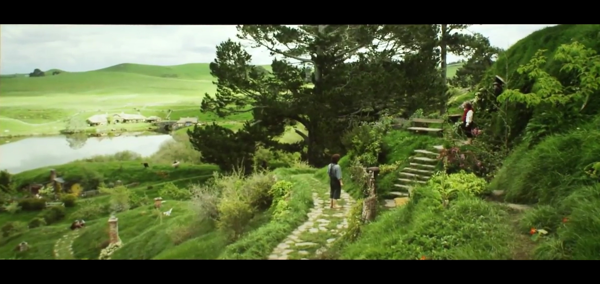
1. The Wrong Order of Operations

The Three Most Common Mistakes Made By Amateur Colorists: Wrong Workflow
Image from Blackmagic

This is probably the number one mistake made by amateur colorists. It’s extremely common for filmmakers without coloring experience to attempt a “look” or grade without first balancing their image. This is breaking the rules of color correction 101.

The absolute first thing you need to do when color grading any piece is to balance all of your shots (contrast, levels, white balance, etc.) so you have a clean slate to work from. Only once your shots are balanced can you go in and set your creative look. If you avoid this step, you’ll never get your shots to match and the look of your finished piece will be very inconsistent.
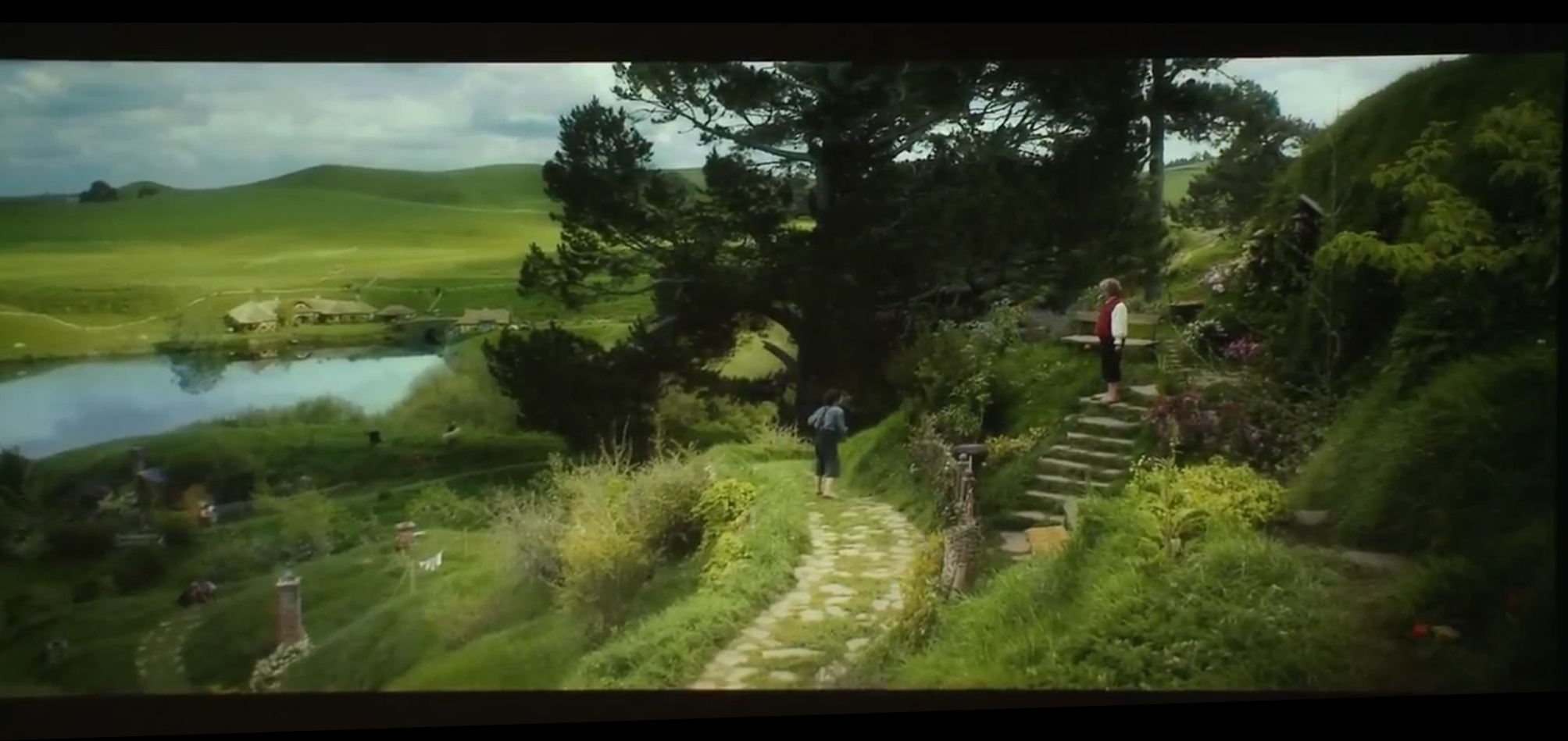
2. Overdoing Looks

The Three Most Common Mistakes Made By Amateur Colorists: Overdoing Looks
An example of extreme color grading. Image from IMDb

Seasoned colorists understand the art of subtlety. They know how to make an image feel warm and inviting without having the audience notice it overtly. Knowing where to draw the line plays a big part in their craft.

Most amateur colorists will push their looks either way too far or not far enough, failing to find that ‘sweet spot’. There’s a time and a place for more extreme looks on both sides of the spectrum… but in 90% of cases, the best result will be found by keeping the look somewhat natural and organic, while still leaving enough room for style.
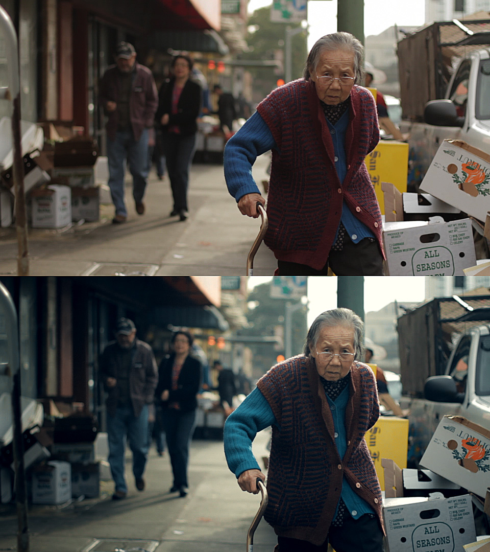
3. Using Presets

The Three Most Common Mistakes Made By Amateur Colorists: Using Pre-sets
Image from Blackmagic

Arguably, the biggest giveaway of an amateur colorist is their overuse of presets or filters. Many filmmakers will start their “color sessions” by clicking around on pre-created looks within the software they’re using, and wind up with a very poor-looking final product.

Personally speaking, I never use any presets for my work, though I’ll occasionally use them to spark creative ideas. This is typically the best way to use presets. You can quickly see what type of looks might work well for your footage (saturated, bleach bypass, black and white, etc.) and then start from scratch to build a custom look that’s tailored to your specific shot.

- - - - -
by
(Article Source)

8:01AM

Red Giant - SALE!

On December 9, 2014, we are having our Red Giant Year-End Sale. Here’s what you need to know:

  • 40% off everything in the redgiant.com store.
  • 24 Hours Only!
  • Sale Starts: 12/9/14 – starting at 08:00 AM PST.
  • Sales ends: 12/10/14 at 08:00 AM PST
  • The sale discount is for everything in the Red Giant store: Full licenses, upgrades, and academic store (which is already 50% off)
  • Includes suites and individual products. 40% off EVERYTHING. Really. We mean it.
  • How to Get 40% off: There will be a coupon code – it will be all over our site. You won’t be able to miss it.

8:00AM

Beyond the Mask - Color Grading

One of the key players in putting the finishing touches on Beyond the Mask was senior colorist Keith Roush. A few weeks ago, Aaron and Chad flew out to LA to work at Keith’s studio, Roush Media, on the color grading process. It was fun talking to Aaron, Chad, and Keith about their time working together and getting a chance to understand what it was like developing the movie’s final, defining look.

The color in the final edit looks stunning. Here Beyond the Mask’s heroine
Charlotte Holloway enters a Philadelphia shop.

Because color grading is an aspect of filmmaking that gets little attention, I’ll let Keith introduce you to the process.  “We refer to our job as color grading. We don’t like to use the term color correction, because that title denotes that you are correcting for an error, so the DP (director of photography) doesn’t like that. What we do is color balancing, color enhancement, and look development. It’s really about setting the mood with warm, happy tones or dark, edgy tones to give the audience visual cues. We are shaping the lighting to enhance the drama of what’s going on in the scene.”

Chad and Aaron were excited about the opportunity to work with Keith. “Keith has a good eye for color,” Chad says. “One of the things that he did really well was understanding how much work to do in each particular scene. It can be easy to get lost in the weeds, twiddling the knobs, and do too much detail work in one particular spot, making the film look patchy. But Keith did a lot of great work keeping it uniform, and he didn’t push any of the details too far.” He has an impressive resume, and as a believer, he has a heart for faith-based films. Some of Roush Media’s most recent projects include the titles God’s Not Dead and Mom’s Night Out.

Image

Roush Media’s equipment is state of the art.

In contrast to some of the more traditional, modern films, however, the job of color grading for Beyond the Mask was a bit more difficult. The details that make an action adventure film exciting, like night scenes, explosions, firelight, and VFX sequences take a lot of skill to properly balance the color. Keith agreed that these elements were challenging, but added that “They can be fun at the same time, especially the visual effects, because we are often doing twenty layers of the various controls on every part of the frame on those shots in order to really shape the lighting and make it as realistic as possible. In the scene with the explosion in the forest, we’re doing a number of color tricks in order to bring out the warm, red fire and have that color contrast against the cold blue moonlit woods. But those are the very beautiful, strongly lit, creatively colored scenes in Beyond the Mask that give the imagery depth and make it stunning to look at.”

One of Keith’s favorite sequences in the film is Will’s dream. Keith elaborates, “Chad and Aaron allowed me to be creative and push the bounds of what was possible with this scene. We created a very stylized look where we’re heavily washed in blue. Then we isolated the red and warm tones to make them pop, which created a unique and beautiful color contrast. It’s a monochromatic blue with very warm tones laid on top of it in a very stark, gloomy way. Then we also blurred the highlights, making it very soft and almost ethereal. It gives you a sense that this is in the mind’s eye. That’s an example of how colors really set the tone for what you’re looking at.”

In discussing their time working together on the color grade, Keith, Chad, and Aaron all commented on the moment they saw the film on the theater screen for the first time. The experience had an impact that they were not expecting. Chad says, “We had been working on this film for almost three years, but had never seen it on a big screen. The details, the acting, the visual effects – everything read better than it had on a smaller screen, and there was something quite charming about seeing the movie on the big screen.” Seeing their work in the theater, with the images of Beyond the Mask finally looking their best was a fitting finale to the process. Keith concurs, about the experience, “When I first watched Beyond the Mask on the little screen on my iPad, I was completely blown away by what they accomplished, so I knew that once we took that to the big screen, and started to do what we do best with the image and color, it was going to look like a Blockbuster, which it ultimately did.”
- - - - - -
(Article Source)

1:29PM

SALE! Davinci Resolve Training

 72 Hours Only!!

DaVinci Resolve 9 & 10 SALE!

Looking for a good deal on our popular DaVinci Power Bundle? Take advantage of the hype and save 35% on our DaVinci 9 & 10 Power Bundle.  Click Here to purchase!
Promo Code: PB35


DaVinci Resolve 11

Expanded Editing, Improved Grading
For a limited time, we are offering our new Editing in DaVinci Resolve 11 at a 25% discount.
Click Here
to purchase today! Promo Code: DAV25

2:55PM

NAB 2013 - Technicolor

Discover a new line of powerful Hollywood color correction and grading tools from the worldwide leader in color. With Color Assist, create stunning video faster and easier than ever before.

Compatible with Final Cut Pro X, and Adobe Premiere CS5.5 & CS6!

Save $20 dollars on Technicolor Color Assist! This offer is good now, through April 11. Just visit the link below and use discount code: NABSHOW20 when you checkout.

Technicolor Website

8:00AM

NEW ReelCast Demo & Color Reels

8:00AM

"The Hobbit" - Color Correction

Color correction is a very integral part of communicating your story to the audience.

In fact, color is so important Peter Jackson once put it this way,

"Color actually effects the mood of the film. It effects the experience of watching the film, juast as the sound FX can or the visual FX, or the acting. The color is often overlooked, but it's a key part of the creative process to a finished film."

- Peter Jackson

Speaking of Peter Jackson, here is a "before-and-after" example from his film The Hobbit.

Check out the full behind-the-scenes video below.
For the section on color, skip to (7:25).

NOTE: I am not endorsing this film, just using it as a resource for educational purposes.

6:54PM

FILM PIPELINE - Part 3

Post Production

"At last, we get to the end of the film pipeline.  Postproduction is everything that comes after shooting has finished."

Topics:
-
Acquisition
-
Visual Effects and Effects Editing
-
Editing, Sound (Editing, Design, Foley, Dialog Editing and A.D.R.) and Music (Scoring)
- Job Descriptions for Post-Prod Jobs
-
Sound Mix
-
Color Grading / Timing and “D.I.“
-
Print It!
- - - - -
By Stephan Vladimir Bugaj

- All the "Film Pipeline" links can now be found in the Basics drop-down menu in the header bar.

12:31PM

Color Correction & Memory Colors

"Memory colors are colors that are, in the minds of your audience, inseparable from certain common objects or events. For example, the sky is so associated with blue that you might feel that you see those two words together as often as you see them individually. The same goes for green and grass.

The most basic idea of color correcting is that you are making colors correct, which is to say that you are making objects on the screen appear to be the colors that we know them to be.

The funny thing about this seemingly simple task is that it can be quite difficult. And it’s difficult for exactly the reason that it’s important.

Here’s a very simple example. I bought some espresso beans today from my favorite local roaster, Blue Bottle coffee. As I was transferring them to an air-tight container, my 7D was right there, so I popped off a quick 720p60 shot of the process—because who doesn’t like seeing coffee beans tumble in slow motion? (see the video here)

When looking at the footage on my computer, I noticed a funny thing. The beans, which in life have a vivid, sumptuous brown tone, appeared gray-black on my screen. I almost didn’t notice, because I know they are brown, but on close inspection it was clear that I had been fooled by my brain into seeing what I knew rather than what was actually there. The cool color temperature of the indirect sun lighting the shot was reflecting off the beans and cooling their color down to near neutral.

There’s nothing unnatural or wrong about this, except that the audience for my espresso epic doesn’t know about the cool light source outside of the frame. They don’t even necessarily know what the falling objects are. I have to communicate that visually, so I need to preserve—or, in this case, recreate—the memory color of perfectly roasted coffee beans.

Here’s the shot with a Colorista Power Mask for just the beans:

And here’s that same shot with an overall look applied after the bean color fix.

To really see the importance of the local correction, look at the shot with the look, but without the bean fix:

Not only do the beans look more appetizing with the fix, they also survive the subsequent look adjustment better. In fact, since the look cools down the shot a bit, the warm color of the beans stands out all the more. Without the bean fix, the look utterly clobbers the brown beans. As a bonus, in the corrected version, the metal canister and the corner of the grinder on the right take on a steely blue color, better matching the viewer’s idea of what color metal should be.

If you pick your memory colors for a scene, and preserve and enhance them through your look, you’ll wind up with shots that pop without looking clobbered by a heavy-handed “preset” look." ~Stu Maschwitz

- - - - -

If this information was helpful, I recommend reading the full article on the ProLost Blog here.

1:00PM

Color Correcting Canon 7D Footage

A frequent concern about shooting to a heavily-compressed digital format—something the DV Rebel often finds herself doing—is the degree to which the footage will be “color correctable.” Will the shots fall apart when subjected to software color grading? Or will you be able to work with the footage as fluidly as you tweak your raw stills in Lightroom?

It’s a valid concern. The movies that the current crop of HDSLRs shoot are highly compressed. This compression is perceptual, meaning that it takes advantage of visually similar colors and shapes, and represents those regions with less accuracy than the detailed and varied parts of the image. This makes perfect sense, but often in color grading one seeks to enhance color contrasts—to make a face pop off a similarly-colored background for example—and so you may well create high contrasts between colors that were once nearly identical, and as such were given short shrift by the camera’s compression.

You might have noticed a similar phenomenon in audio. An low-bit-rate MP3 that sounds decent enough can suddently sound awful after even a tiny amount of EQ. Another case of perceptual compression limiting your options.

While you will never find as much data and detail in your HDSLR video as you do in that same camera’s raw stills, the H.264 movies created by the Canon 7D, 5D and 1D Mark IV will withstand some massaging in post. Here are some tips (similar to those found in greater detail in The DV Rebel’s Guide) to help you get the best results....

Read the full article here.