


Color Correction & Memory Colors
"Memory colors are colors that are, in the minds of your audience, inseparable from certain common objects or events. For example, the sky is so associated with blue that you might feel that you see those two words together as often as you see them individually. The same goes for green and grass.
The most basic idea of color correcting is that you are making colors correct, which is to say that you are making objects on the screen appear to be the colors that we know them to be.
The funny thing about this seemingly simple task is that it can be quite difficult. And it’s difficult for exactly the reason that it’s important.
Here’s a very simple example. I bought some espresso beans today from my favorite local roaster, Blue Bottle coffee. As I was transferring them to an air-tight container, my 7D was right there, so I popped off a quick 720p60 shot of the process—because who doesn’t like seeing coffee beans tumble in slow motion? (see the video here)
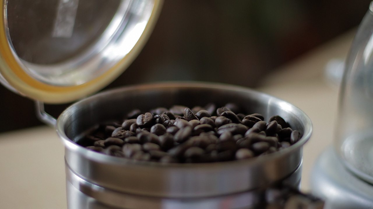
When looking at the footage on my computer, I noticed a funny thing. The beans, which in life have a vivid, sumptuous brown tone, appeared gray-black on my screen. I almost didn’t notice, because I know they are brown, but on close inspection it was clear that I had been fooled by my brain into seeing what I knew rather than what was actually there. The cool color temperature of the indirect sun lighting the shot was reflecting off the beans and cooling their color down to near neutral.
There’s nothing unnatural or wrong about this, except that the audience for my espresso epic doesn’t know about the cool light source outside of the frame. They don’t even necessarily know what the falling objects are. I have to communicate that visually, so I need to preserve—or, in this case, recreate—the memory color of perfectly roasted coffee beans.
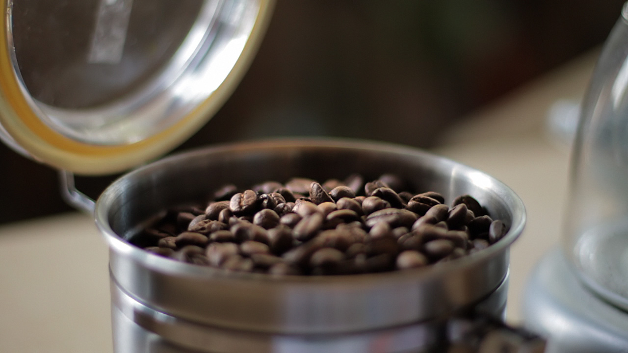
Here’s the shot with a Colorista Power Mask for just the beans:
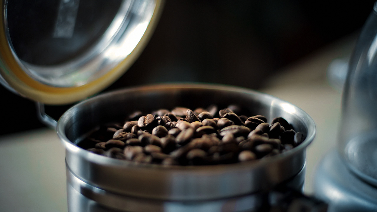
And here’s that same shot with an overall look applied after the bean color fix.
To really see the importance of the local correction, look at the shot with the look, but without the bean fix:
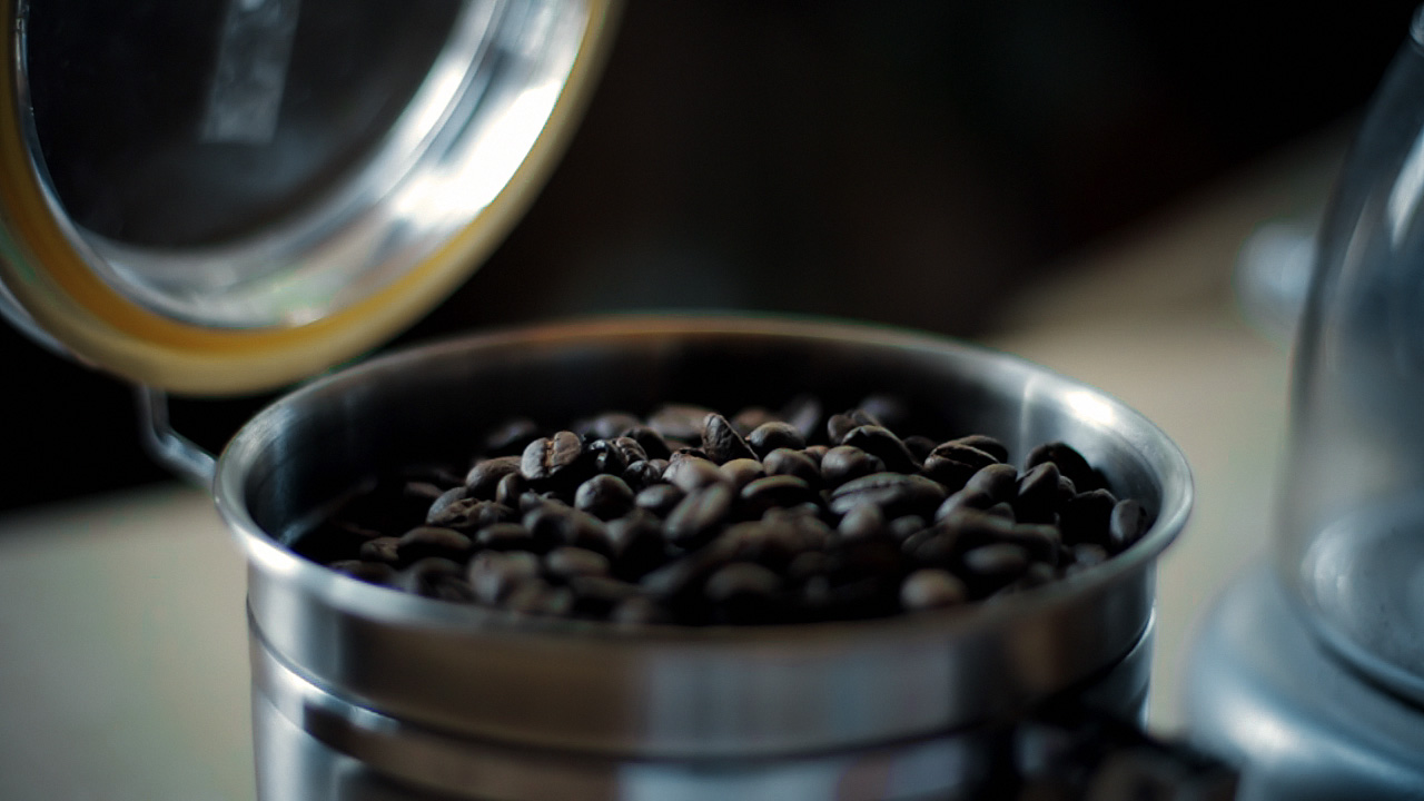
Not only do the beans look more appetizing with the fix, they also survive the subsequent look adjustment better. In fact, since the look cools down the shot a bit, the warm color of the beans stands out all the more. Without the bean fix, the look utterly clobbers the brown beans. As a bonus, in the corrected version, the metal canister and the corner of the grinder on the right take on a steely blue color, better matching the viewer’s idea of what color metal should be.
If you pick your memory colors for a scene, and preserve and enhance them through your look, you’ll wind up with shots that pop without looking clobbered by a heavy-handed “preset” look." ~Stu Maschwitz
- - - - -
If this information was helpful, I recommend reading the full article on the ProLost Blog here.
 Post a Comment
Reader Comments